The team at the BBC created an animation why we need to stay at home and to keep our distance to save the NHS using scientific modelling by Imperial College London COVID-19 Response Team, led by Professor Neil Ferguson from the MRC Centre for Global Infectious Disease Analysis.
Category Archives: Animation
The big lesson from South Korea’s coronavirus response
Vox explained how South Korea flattened the curve of the novel coronavirus. The hints: a combination of aggressive and widespread testing measures, along with a system know as “contact tracing”.
Break the chain
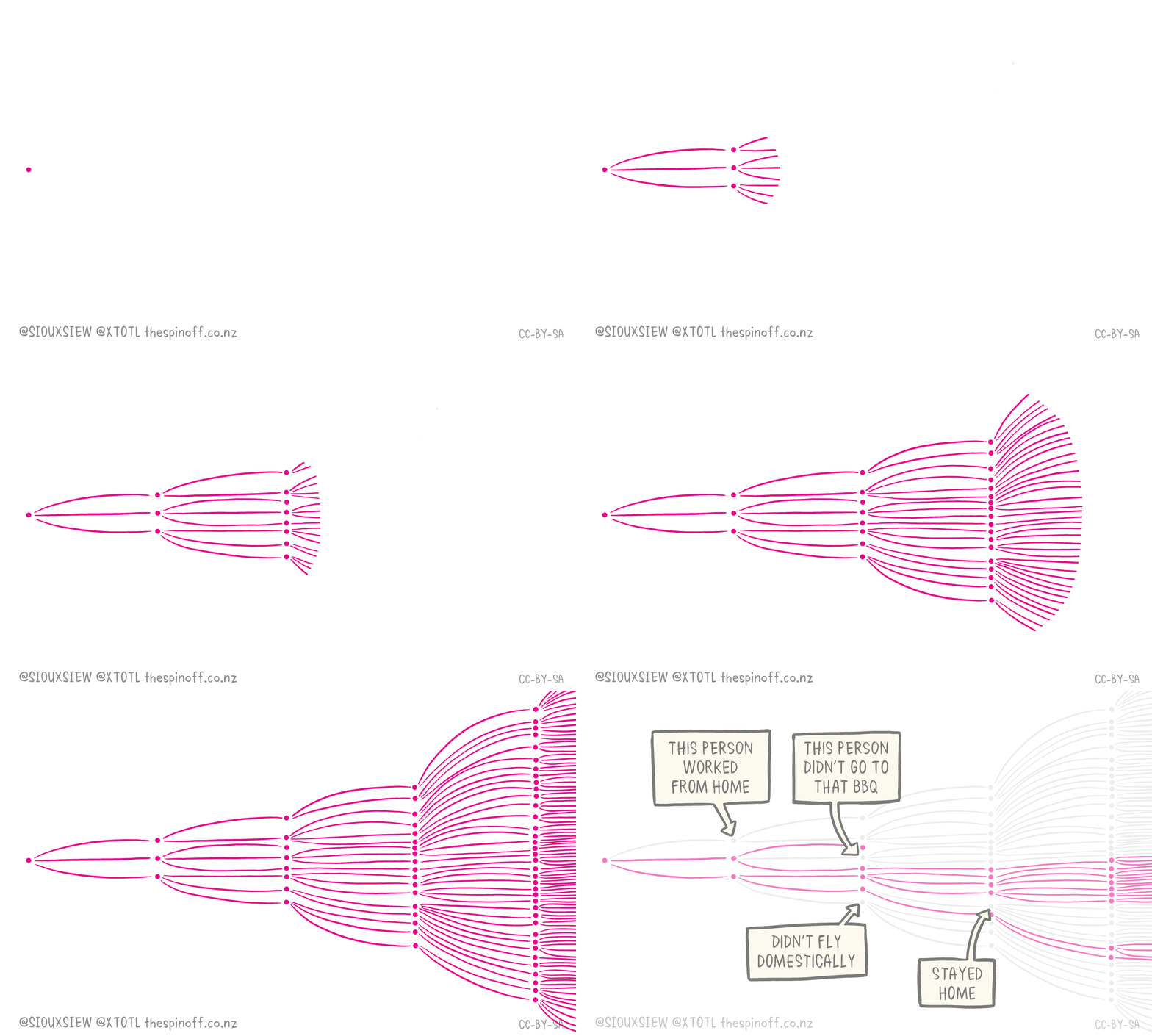
Check out The Spinoff cartoonist Toby Morris’ excellent illustration to understand how individual discipline can have an outsize impact in an article by Dr Siouxsie Wiles. By breaking these chains, we potentially stop hundreds or even thousands of people getting Covid-19.
Coronavirus Explained and What You Should Do
Kurzgesagt explains the coronavirus and what you should do. The best thing to do is to wash your hand and keep your distance.
What Coronavirus Symptoms Look Like, Day By Day
After being exposed to the virus that causes COVID-19, it can take as few as two and as many as 14 days for symptoms to develop. Cases range from mild to critical. The average timeline from the first symptom to recovery is about 17 days, but some cases are fatal. Here’s what it looks likeContinue reading “What Coronavirus Symptoms Look Like, Day By Day”
Flatten the Curve
In recent days, people are talking about flattening the coronavirus curve. One way to do it is to slow the spread of the virus through community transmission and there are fewer people in need of access to the hospital at the same time. This version of the “flatten the curve” is illustrated by Toby MorrisContinue reading “Flatten the Curve”


