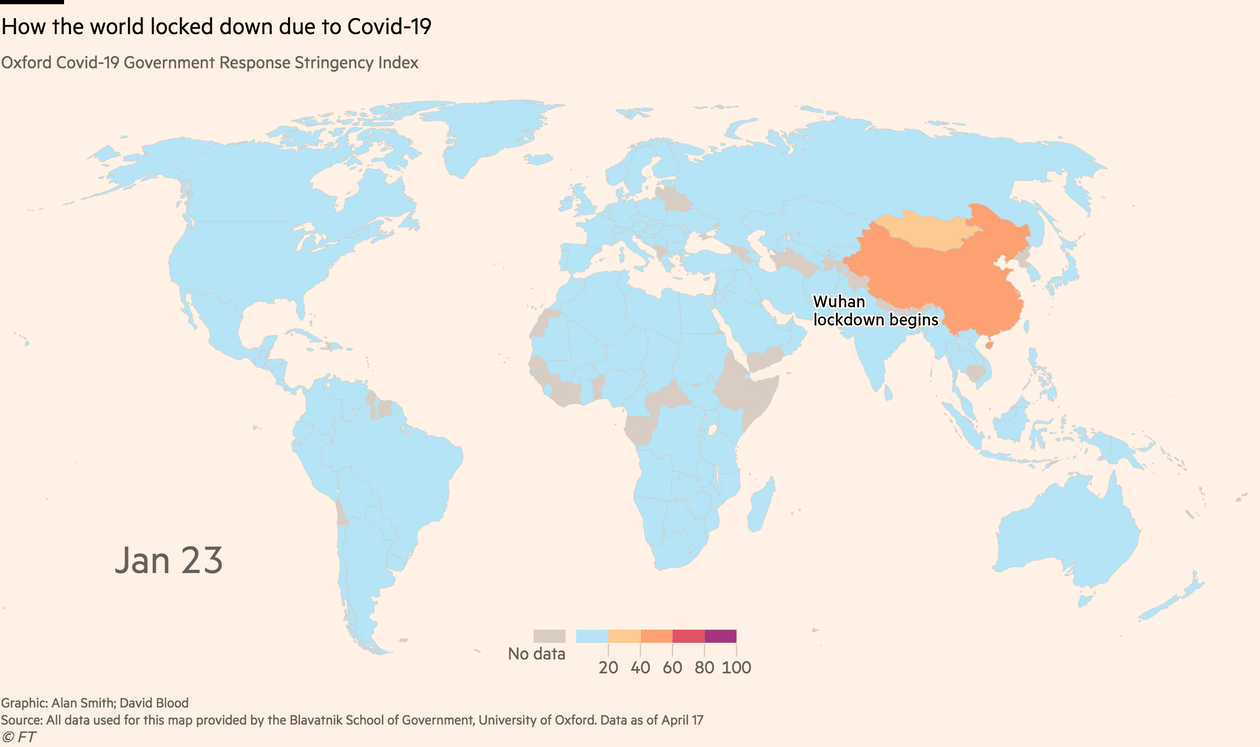
For Financial Times, Alan Smith and David Blood created a map using the data from Oxford Covid-19 Government Response Stringency Index. This index is created by The Oxford COVID-19 Government Response Tracker (OxCGRT) at Blavatnik School of Government, University of Oxford. As Covid-19 spread beyond China, governments responded by implementing containment measures with varying degrees ofContinue reading “Oxford Covid-19 Government Response Stringency Index”
Category Archives: Data Visualisation
Improvement in air quality
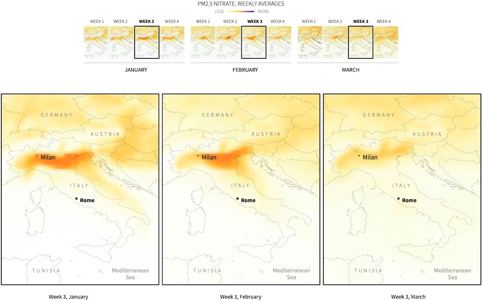
Northern Italy is Italy’s powerhouse. The industrial belt across northern Italy often experiences high levels of air pollution, but Reuters reported that Bergamo, one of the provinces most affected by the virus, has experienced improvements in air quality.
The second wave of coronavirus in Hong Kong, Taiwan, and Singapore

Hong Kong, Taiwan and Singapore are now confronting the second wave of coronavirus (Covid-19). However, this time, this second wave of transmission is predominantly from imported transmissions. For The New York Times, K.K. Rebecca Lai shows the top 15 places where people confirmed with coronavirus had travelled to.
Our World in Data: Coronavirus (COVID-19) Visualisation

Our World in Data with its mission to build an infrastructure that makes research and data openly available and useful for all has been compiling research and data related with Coronavirus (COVID-19) with links to its sources. You can find more than 40 visualisations about COVID-19 in total on their website. Most of our workContinue reading “Our World in Data: Coronavirus (COVID-19) Visualisation”
How coronavirus spread across the globe in the first 100 days?

In just 100 days, reports show that more than 1.5 million confirmed cases and more than 88,000 people have been killed by the coronavirus (Covid-19) across the globe. Seán Clarke, Antonio Voce, Pablo Gutiérrez and Frank Hulley-Jones visualised the first 100 days of this disease for the Guardians.
Covid-19 deaths has switched from Asia to Europe and now the US

For Financial Times, Steven Bernard created this beautiful streamgraph and stacked column charts, showing how the focus of Covid-19 deaths has switched from Asia to Europe – and now the US. This visualisation is also part of free to read Financial Times virus tracker page.
Prof. Arief Yusuf: Economy can recover, but we can’t recover dead bodies

Prof. Arief Anshory Yusuf, my boss at SDGs Center Unpad and my undergraduate supervisor, calculated the impact of coronavirus on Indonesian economy over the next five years. His simulation with IndoTERM economic model shows that Indonesian economic growth in 2020 estimated to be 1.24%, this is 3.7% lower than forecast at 5.2%. You can findContinue reading “Prof. Arief Yusuf: Economy can recover, but we can’t recover dead bodies”
